Google’s Mobile-First Indexing has completely changed the way websites are ranked and optimized. Previously, Google primarily used the desktop version of a website to index and rank pages. However, as mobile internet usage skyrocketed, Google shifted its approach: now the mobile version of your site is considered the primary version for indexing and ranking.
This change means that your On-Page SEO strategies can no longer be desktop-first. Instead, every optimization you do — from content layout to technical setup — must prioritize mobile usability, speed, and experience.

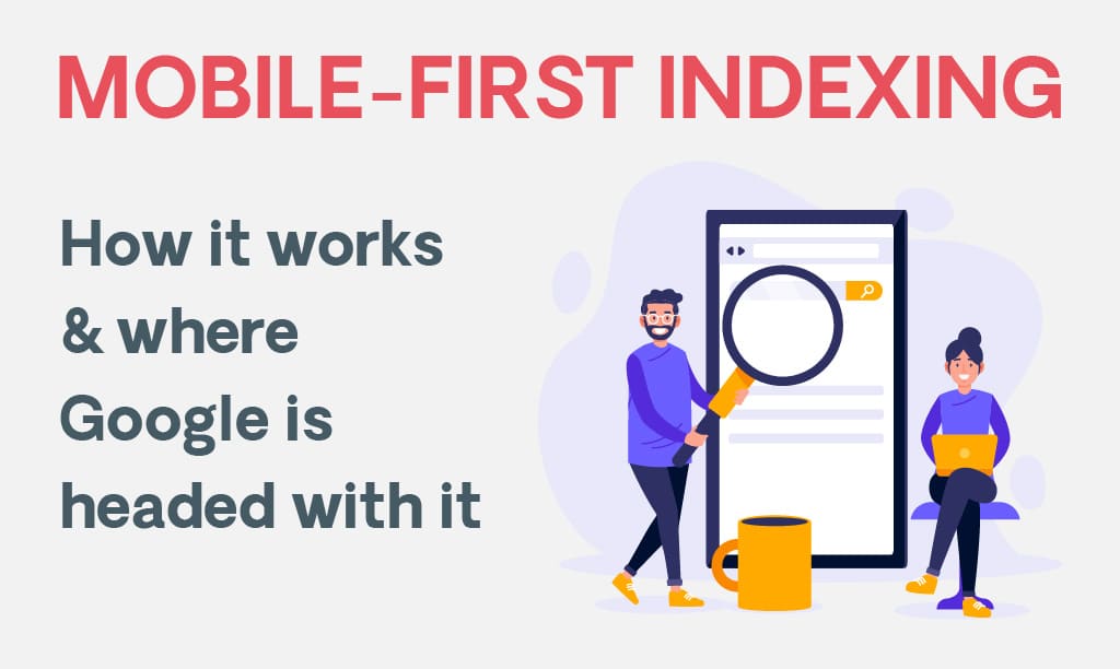
2. What is Mobile-First Indexing?
Mobile-first indexing means:
- Google predominantly uses the mobile version of your content for indexing and ranking.
- If your mobile site is different from your desktop site, the mobile version’s content is what Google sees and evaluates.
- This applies to both mobile-responsive designs and separate mobile sites (m.domain.com).
📌 Key point: Mobile-first doesn’t mean mobile-only — desktop users still see your desktop site, but Google’s indexing system gives priority to the mobile version.
3. Why Google Moved to Mobile-First Indexing
The shift was driven by user behavior and search patterns:
- Over 60% of Google searches now come from mobile devices.
- Mobile usage growth outpaced desktop years ago.
- Poor mobile experiences led to higher bounce rates, hurting user satisfaction.
- Google aims to deliver the best possible results for the device people are using.
4. Direct Impact on On-Page SEO Strategies
Here’s how Mobile-First Indexing affects every area of On-Page SEO:
A. Content Accessibility & Consistency
Impact:
If your mobile site has less content than the desktop version (like hidden sections or stripped-down text), Google will only see the mobile version — meaning important content might be ignored.
Optimization Strategy:
- Ensure identical, crawlable content on both mobile and desktop.
- Avoid hiding important text in expandable tabs just for mobile unless it’s still HTML-readable.
- Keep all headings (H1, H2, H3) consistent across devices.
📌 Pro Tip: Use responsive design so you don’t have to maintain two different versions of your content.
B. Mobile Page Speed & Core Web Vitals
Impact:
Mobile users expect fast-loading pages. Google uses Core Web Vitals — Largest Contentful Paint (LCP), First Input Delay (FID), and Cumulative Layout Shift (CLS) — as ranking signals, heavily influenced by mobile speed.
Optimization Strategy:
- Compress and lazy-load images.
- Minimize render-blocking JavaScript and CSS.
- Use AMP (Accelerated Mobile Pages) only if it fits your content goals.
- Implement server-side caching and a CDN for faster delivery.
📌 Pro Tip: Aim for under 2.5 seconds load time on mobile.
C. Mobile-Friendly Design & User Experience (UX)
Impact:
Even if your content is amazing, poor mobile UX — like small text, tiny buttons, or unresponsive layouts — will hurt rankings.
Optimization Strategy:
- Use responsive design that adapts to all screen sizes.
- Make touch targets (buttons, links) large enough for fingers.
- Use readable font sizes (16px or more).
- Avoid horizontal scrolling.
📌 Pro Tip: Test mobile usability in Google Search Console’s Mobile Usability Report.
D. Structured Data for Mobile
Impact:
If structured data (schema markup) is missing from your mobile site but present on desktop, Google might not recognize your rich snippets.
Optimization Strategy:
- Apply identical structured data to both versions.
- Test using Google’s Rich Results Test tool.
📌 Pro Tip: Keep schema markup JSON-LD format consistent in responsive designs.
E. Internal Linking & Navigation
Impact:
If your mobile site uses a collapsed or minimal menu, you might unintentionally hide important internal links that help Google crawl your site.
Optimization Strategy:
- Keep key internal links accessible in mobile menus.
- Use breadcrumb navigation for better UX and SEO.
- Ensure footer links remain intact on mobile.
F. Image & Video Optimization for Mobile
Impact:
Unoptimized media slows down mobile load times and impacts engagement.
Optimization Strategy:
- Use next-gen formats like WebP for images.
- Compress images without losing quality.
- Ensure videos are responsive and playable on mobile.
- Add alt text for images and transcripts for videos.

G. Meta Tags & Titles on Mobile
Impact:
If your mobile site has shorter titles or meta descriptions, it may reduce keyword targeting power.
Optimization Strategy:
- Use the same title tags and meta descriptions across mobile and desktop.
- Keep meta descriptions within 120-155 characters for mobile SERP visibility.

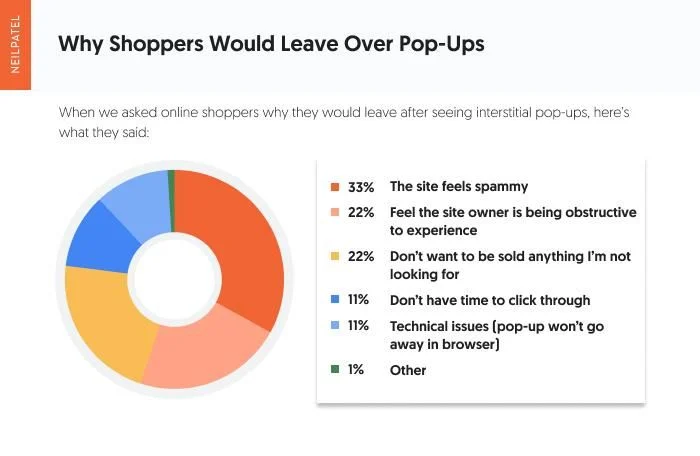
H. Pop-ups & Interstitials
Impact:
Intrusive pop-ups on mobile can block content, leading to Google penalties for poor user experience.
Optimization Strategy:
- Use non-intrusive banners instead of full-screen pop-ups.
- Ensure pop-ups are easy to close on small screens.
5. Technical SEO Adjustments for Mobile-First
- Same robots.txt rules for mobile and desktop.
- Ensure mobile sitemaps are up-to-date.
- Use responsive meta viewport tags.
- Keep canonical tags consistent.
- Implement lazy loading correctly so Googlebot can still index images.
6. Measuring Mobile-First SEO Success
- Use Google Search Console’s Mobile Usability Report.
- Track mobile-specific traffic in Google Analytics.
- Monitor mobile rankings separately from desktop.
- Use tools like PageSpeed Insights to test mobile load speed.
7. Common Mistakes to Avoid
- Having different primary content on mobile vs desktop.
- Hiding navigation or important links on mobile.
- Forgetting structured data on mobile.
- Using images that are too large for mobile devices.
- Ignoring mobile-specific Core Web Vitals.
8. The Future of On-Page SEO in a Mobile-First World
With voice search, AI search assistants, and visual search becoming popular, mobile-first optimization will also mean:
- Creating conversational, voice-friendly content.
- Using schema markup to support AI-driven SERPs.
- Focusing on visual-first layouts that load instantly on mobile devices.
9. Final Takeaway
Mobile-First Indexing isn’t just a technical update — it’s a complete shift in SEO mindset. It forces businesses to think mobile-first, desktop-second. On-Page SEO now requires:
- Mobile-responsive content.
- Speed optimization.
- Consistent metadata and structured data.
- Accessible navigation.
- User-friendly design for small screens.
In short, if your mobile experience is poor, your SEO rankings will suffer — even for desktop searches.
✅ One-Line Summary: Mobile-First Indexing has made mobile optimization the backbone of On-Page SEO. If it’s not optimized for mobile, it’s not optimized for Google.
📞 Need help optimizing for Mobile-First Indexing? Contact Us today!
💬 Have questions? Drop a comment below — we’d love to hear from you!
📌 Follow us on social media for daily SEO tips & updates:
- Facebook: https://www.facebook.com/profile.php?id=61573704189902
- Instagram: https://www.instagram.com/
- LinkedIn: https://www.linkedin.com/feed/